
Bootstrap Card Component: A Complete Introduction
Bootstrap is one of the most popular front-end frameworks for building responsive and mobile-friendly websites. It provides developers with ready-to-use components, responsive utilities, layout systems, and styling classes that make it easier to create modern web interfaces without writing every CSS rule from scratch.
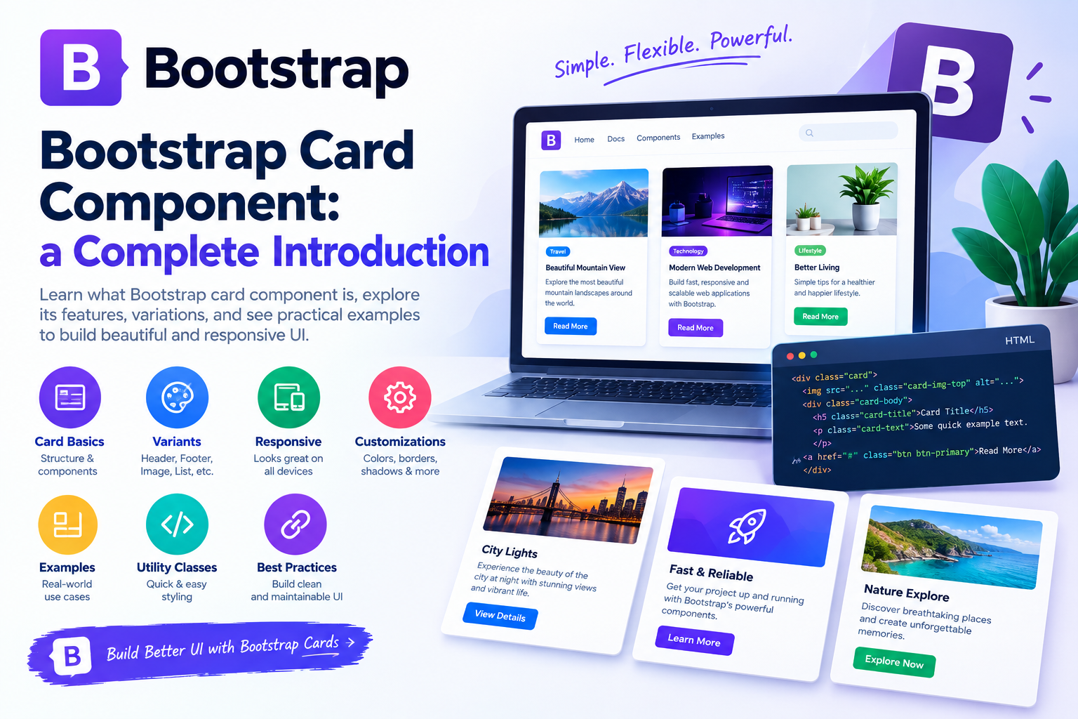
What Is a Bootstrap Card?
A Bootstrap Card is a flexible content container that provides a structured way to display information.
A card can contain different types of content, including:
-> Images
-> Titles
-> Text
-> Buttons
-> Links
-> Headers
-> Footers
-> Lists
-> Badges
-> Other Bootstrap components
The basic card structure is created using the `.card` class.
For example, the following HTML creates a simple Bootstrap card:
“`html
<div class=”card”>
<div class=”card-body”>
<h5 class=”card-title”>Bootstrap Card</h5>
<p class=”card-text”>This is a simple Bootstrap card.</p>
</div>
</div>
“`
The important point here is that the HTML tags are escaped using `<` and `>`. This allows the code to appear as text instead of being interpreted as actual HTML by the browser.
Why Use Bootstrap Cards?
Bootstrap Cards are popular because they provide a consistent structure while requiring very little custom CSS.
Instead of creating a card layout from scratch, developers can use Bootstrap’s built-in classes.
Cards are especially useful when a page contains multiple independent content sections.
For example, a website can use cards to display products:
“`html
<div class=”card”>
<img src=”product.jpg” class=”card-img-top” alt=”Product”>
<div class=”card-body”>
<h5 class=”card-title”>Product Name</h5>
<p class=”card-text”>Product description goes here.</p>
<a href=”#” class=”btn btn-primary”>View Product</a>
</div>
</div>
“`
This structure can be reused for products, services, blog posts, portfolios, and other content types.
Basic Bootstrap Card Structure
A basic Bootstrap Card normally contains a parent `.card` element and a `.card-body` section.
The basic structure looks like this:
“`html
<div class=”card”>
<div class=”card-body”>
Content goes here
</div>
</div>
“`
The `.card` class creates the card container.
The `.card-body` class adds the required padding and provides a suitable area for the card content.
Creating a Simple Card
Let’s create a simple card containing a heading and paragraph.
“`html
<div class=”card”>
<div class=”card-body”>
<h5 class=”card-title”>Welcome to Bootstrap</h5>
<p class=”card-text”>
Bootstrap makes it easy to create responsive user interfaces.
</p>
</div>
</div>
“`
This creates a clean card containing a title and description.
You can also add a button to make the card interactive.
“`html
<div class=”card”>
<div class=”card-body”>
<h5 class=”card-title”>Learn Bootstrap</h5>
<p class=”card-text”>
Start learning Bootstrap components and responsive layouts.
</p>
<a href=”#” class=”btn btn-primary”>
Learn More
</a>
</div>
</div>
“`
Adding Images to Bootstrap Cards
Images are commonly used inside Bootstrap Cards.
Bootstrap provides the `.card-img-top` class for images displayed at the top of a card.
Example:
“`html
<div class=”card”>
<img
src=”image.jpg”
class=”card-img-top”
alt=”Bootstrap Card”
>
<div class=”card-body”>
<h5 class=”card-title”>Bootstrap Card</h5>
<p class=”card-text”>
Learn how to create responsive Bootstrap cards.
</p>
</div>
</div>
“`
The `alt` attribute should always be included to provide meaningful alternative text for users who rely on screen readers.
Card Images at the Bottom
Images do not always have to appear at the top.
You can place an image after the card body as well.
“`html
<div class=”card”>
<div class=”card-body”>
<h5 class=”card-title”>Bootstrap Card</h5>
<p class=”card-text”>
This card contains an image at the bottom.
</p>
</div>
<img
src=”image.jpg”
class=”card-img-bottom”
alt=”Bootstrap Example”
>
</div>
“`
The `.card-img-bottom` class is useful when the image should visually appear below the content.
Adding Buttons to Cards
Cards frequently contain buttons or links.
Bootstrap button classes can be combined with cards to create interactive components.
“`html
<div class=”card”>
<div class=”card-body”>
<h5 class=”card-title”>Bootstrap Course</h5>
<p class=”card-text”>
Learn Bootstrap from beginner to advanced level.
</p>
<a href=”#” class=”btn btn-primary”>
Start Learning
</a>
</div>
</div>
“`
You can also use different Bootstrap button styles such as:
“`html
<a href=”#” class=”btn btn-primary”>Primary</a>
<a href=”#” class=”btn btn-success”>Success</a>
<a href=”#” class=”btn btn-danger”>Delete</a>
<a href=”#” class=”btn btn-warning”>Warning</a>
“`
Bootstrap Card Header
A card can contain a header section using `.card-header`.
Example:
“`html
<div class=”card”>
<div class=”card-header”>
Featured Article
</div>
<div class=”card-body”>
<h5 class=”card-title”>Bootstrap Cards</h5>
<p class=”card-text”>
Learn how Bootstrap Cards work.
</p>
</div>
</div>
“`
The header can be useful for labels, categories, section names, or other introductory information.
Card Subtitles
Bootstrap also supports the `.card-subtitle` class.
“`html
<div class=”card”>
<div class=”card-body”>
<h5 class=”card-title”>Bootstrap Card</h5>
<h6 class=”card-subtitle mb-2 text-muted”>
Frontend Development
</h6>
<p class=”card-text”>
Learn how to use Bootstrap Cards effectively.
</p>
</div>
</div>
“`
The subtitle is useful for displaying secondary information below the main card title.
Card Links
You can add links inside a card using `.card-link`.
“`html
<div class=”card”>
<div class=”card-body”>
<h5 class=”card-title”>Bootstrap Resources</h5>
<a href=”#” class=”card-link”>
Documentation
</a>
<a href=”#” class=”card-link”>
Tutorials
</a>
</div>
</div>
“`
This is useful when a card needs multiple related navigation links.
Bootstrap Cards with the Grid System
One of the biggest advantages of Bootstrap Cards is that they work well with the Bootstrap Grid System.
You can place multiple cards inside rows and columns.
Example:
“`html
<div class=”container”>
<div class=”row”>
<div class=”col-md-4″>
<div class=”card”>
<div class=”card-body”>
<h5 class=”card-title”>Card One</h5>
<p class=”card-text”>
First card content.
</p>
</div>
</div>
</div>
<div class=”col-md-4″>
<div class=”card”>
<div class=”card-body”>
<h5 class=”card-title”>Card Two</h5>
<p class=”card-text”>
Second card content.
</p>
</div>
</div>
</div>
<div class=”col-md-4″>
<div class=”card”>
<div class=”card-body”>
<h5 class=”card-title”>Card Three</h5>
<p class=”card-text”>
Third card content.
</p>
</div>
</div>
</div>
</div>
</div>
“`
The grid automatically adjusts the card layout based on screen size.
Creating Equal-Height Cards
When cards contain different amounts of content, their heights may differ.
Bootstrap’s grid and flex utilities can help create equal-height card layouts.
For example:
“`html
<div class=”row”>
<div class=”col-md-4 d-flex”>
<div class=”card w-100″>
<div class=”card-body”>
<h5 class=”card-title”>Card One</h5>
<p class=”card-text”>
Short content.
</p>
</div>
</div>
</div>
<div class=”col-md-4 d-flex”>
<div class=”card w-100″>
<div class=”card-body”>
<h5 class=”card-title”>Card Two</h5>
<p class=”card-text”>
This card contains more content than the first card.
</p>
</div>
</div>
</div>
</div>
“`
Using `d-flex` and `w-100` can help the cards fill the available column height consistently.
Bootstrap Card Performance Considerations
Cards themselves are lightweight components, but pages containing many cards can still become slow if they include large images, unnecessary JavaScript, or poorly optimized resources.
Images should be compressed and appropriately sized.
Lazy loading can also be useful for images that are not immediately visible.
For example:
“`html
<img
src=”large-image.jpg”
class=”card-img-top”
loading=”lazy”
alt=”Example image”
>
“`
Using optimized images can improve page loading performance, especially on mobile devices.
Bootstrap Cards and SEO
Cards can also support SEO-friendly content structures when implemented correctly.
For blog cards, use meaningful headings and descriptive links.
For example:
“`html
<article class=”card”>
<div class=”card-body”>
<h2 class=”card-title”>
Bootstrap Card Component Guide
</h2>
<p class=”card-text”>
Learn how to create responsive Bootstrap Cards.
</p>
<a href=”/bootstrap-card-guide”>
Read the complete guide
</a>
</div>
</article>
“`
Semantic HTML elements such as `
When the code itself needs to be displayed as text on a webpage, remember that angle brackets should be escaped as `<` and `>`.
Common Bootstrap Card Design Improvements
A basic Bootstrap Card can be improved with a few design decisions.
Use consistent image dimensions so that card layouts remain visually balanced.
Use consistent spacing between cards.
Keep titles similar in length where possible.
Use clear primary actions.
Avoid excessive text inside cards.
Use subtle shadows and borders.
Make sure cards remain readable on smaller screens.
Keep the design consistent across the entire website.
A good card design should guide users toward the most important information without overwhelming them.
Bootstrap Cards vs Custom Cards
Bootstrap Cards are a good choice when you want to build interfaces quickly and maintain consistency.
Custom cards may be more appropriate when a project has highly specific visual requirements.
Bootstrap provides the foundation, while custom CSS can be added when necessary.
For many business websites, dashboards, admin panels, blogs, and internal applications, Bootstrap Cards provide enough flexibility without requiring a completely custom component system.
Final Thoughts
Bootstrap Card is one of the most useful components available in Bootstrap. Its flexible structure allows developers to create everything from simple content containers to complex product grids and dashboard interfaces.
The basic structure is easy to understand:
“`html
<div class=”card”>
<div class=”card-body”>
Card content
</div>
</div>
“`
From there, you can add images, titles, subtitles, buttons, headers, footers, links, badges, responsive grid layouts, and custom styling.
The most important thing is not simply knowing the Bootstrap Card classes. Developers should also understand how to organize content, create responsive layouts, maintain consistent spacing, optimize images, and consider accessibility.
When used correctly, Bootstrap Cards can make websites more organized, responsive, and visually consistent while significantly reducing the amount of custom CSS required.
One important implementation detail for documentation and Markdown-based websites is that HTML examples intended to be displayed as code should be escaped using `<` and `>`. This prevents the browser from interpreting the example as real HTML and ensures that visitors can see the actual code.
With these techniques, Bootstrap Cards can be effectively used across modern websites, admin dashboards, e-commerce platforms, blogs, portfolios, and business applications.